Building a design system– leading the creation of a design system for a legacy site.
📊 Key outcomes
Design efficiency
Reduced design delivery time by 40%, enabling faster feature iterations and clearing a backlog of design tickets.
Visual consistency
Replaced divergent UI patterns with standardised components across core flows (e.g., onboarding, purchasing).
UI Quality
Improved colour contrast, spacing, and layout hierarchy—resulting in a 25% drop in UI-related support tickets.
Developer Collaboration
Integrated with Storybook, aligning design and development workflows for smoother handoffs.
Team Efficiency
Enabled efficient onboarding of new designers through structured documentation.
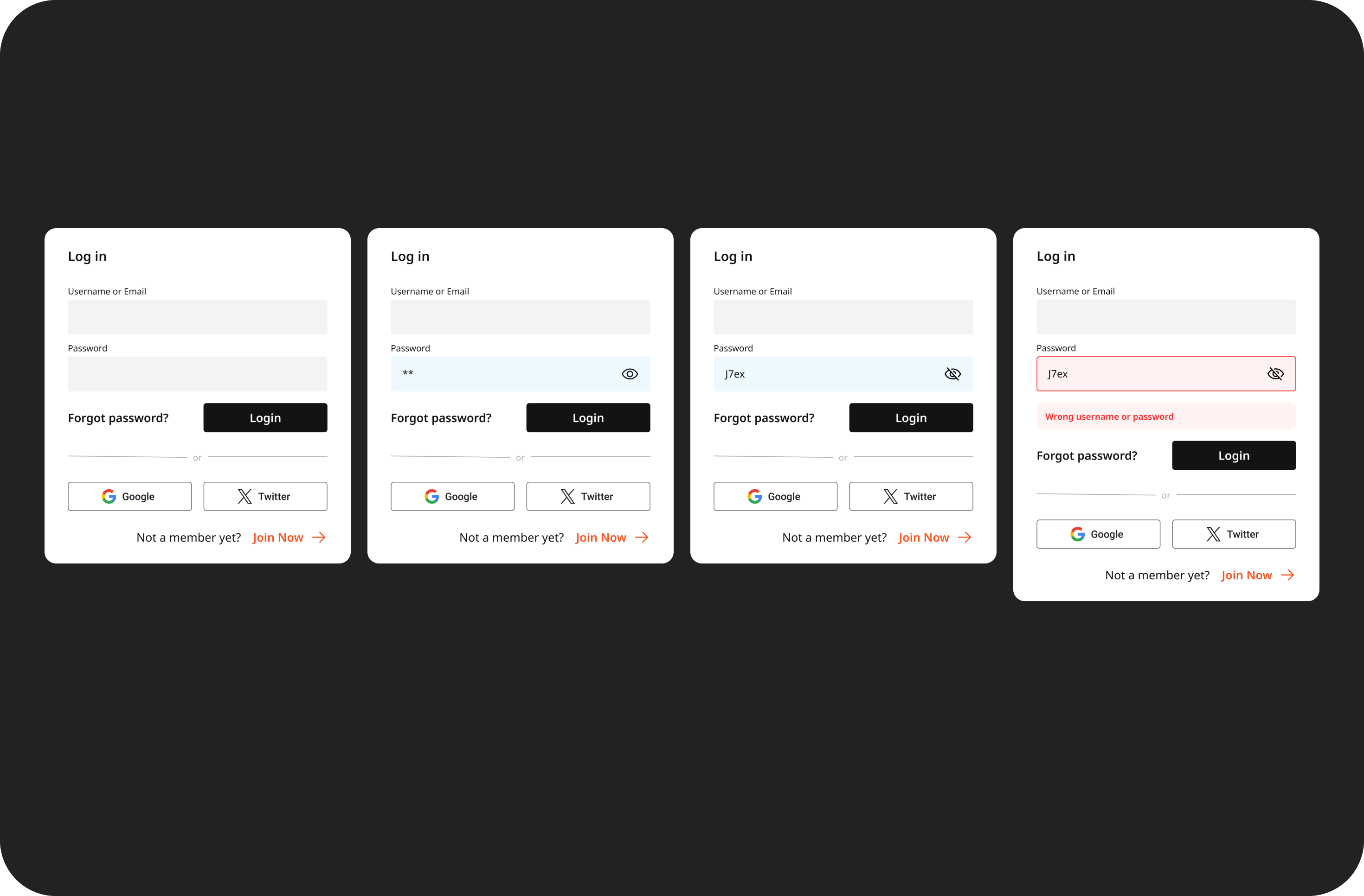 Standardised form fields with selected and error states
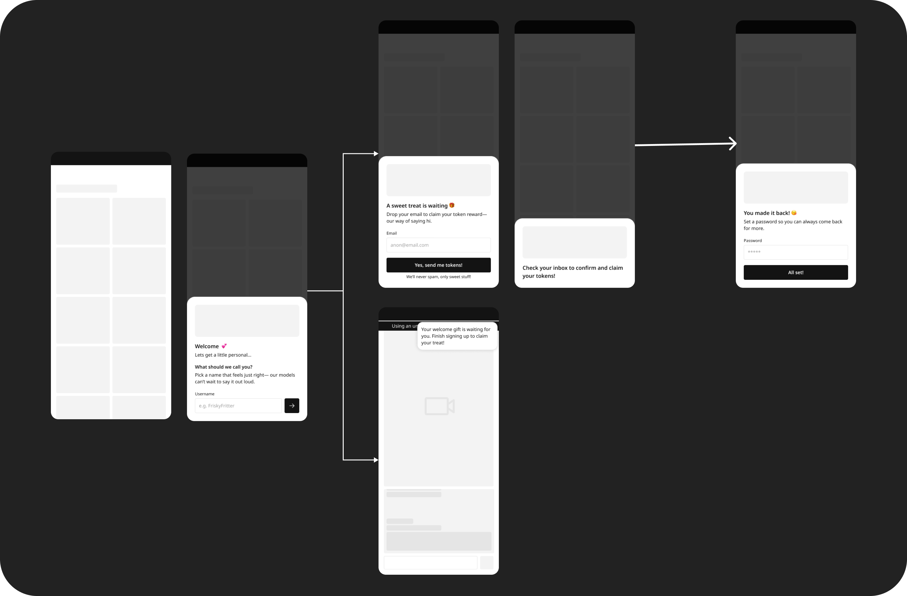 Designed a new gradual engagement sign up with new visual hierarchy
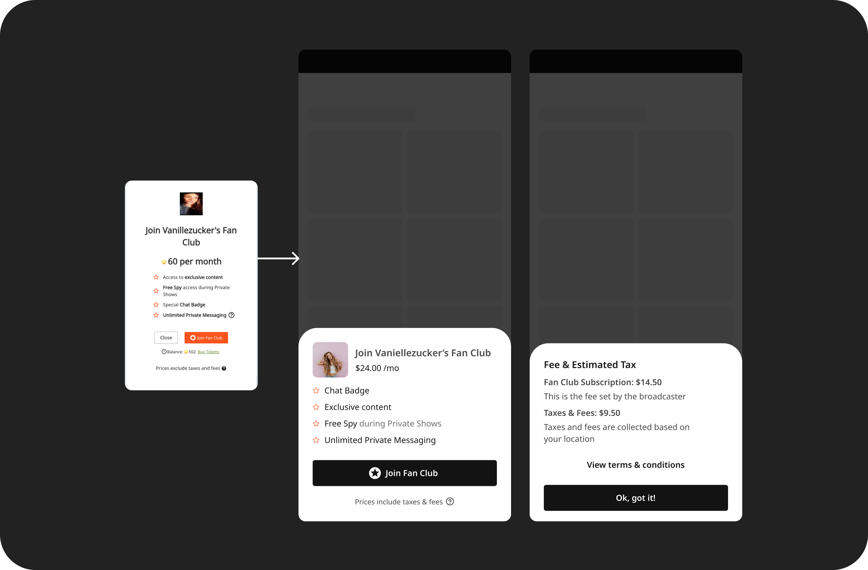
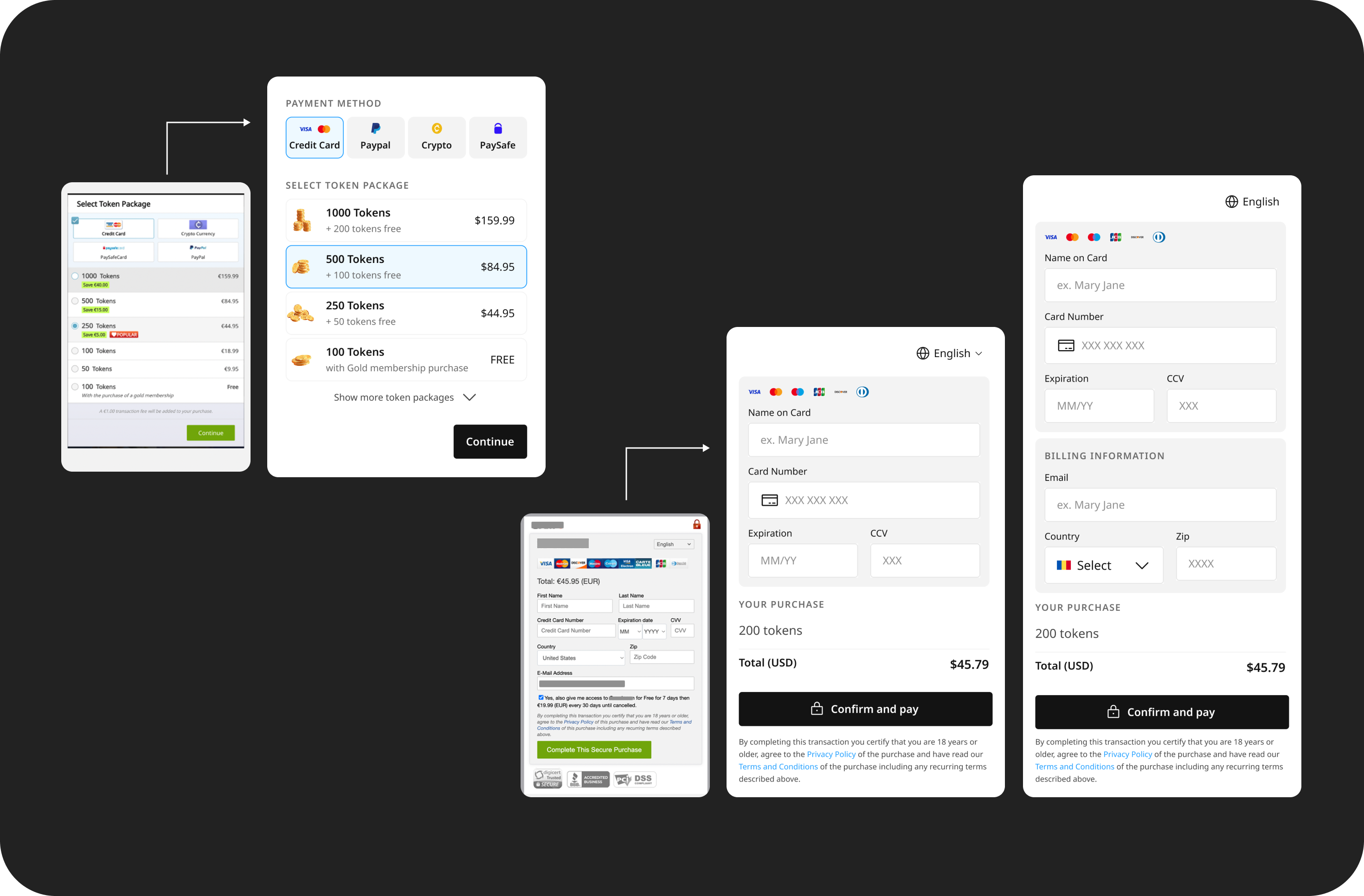 New versions of token purchase & check out form
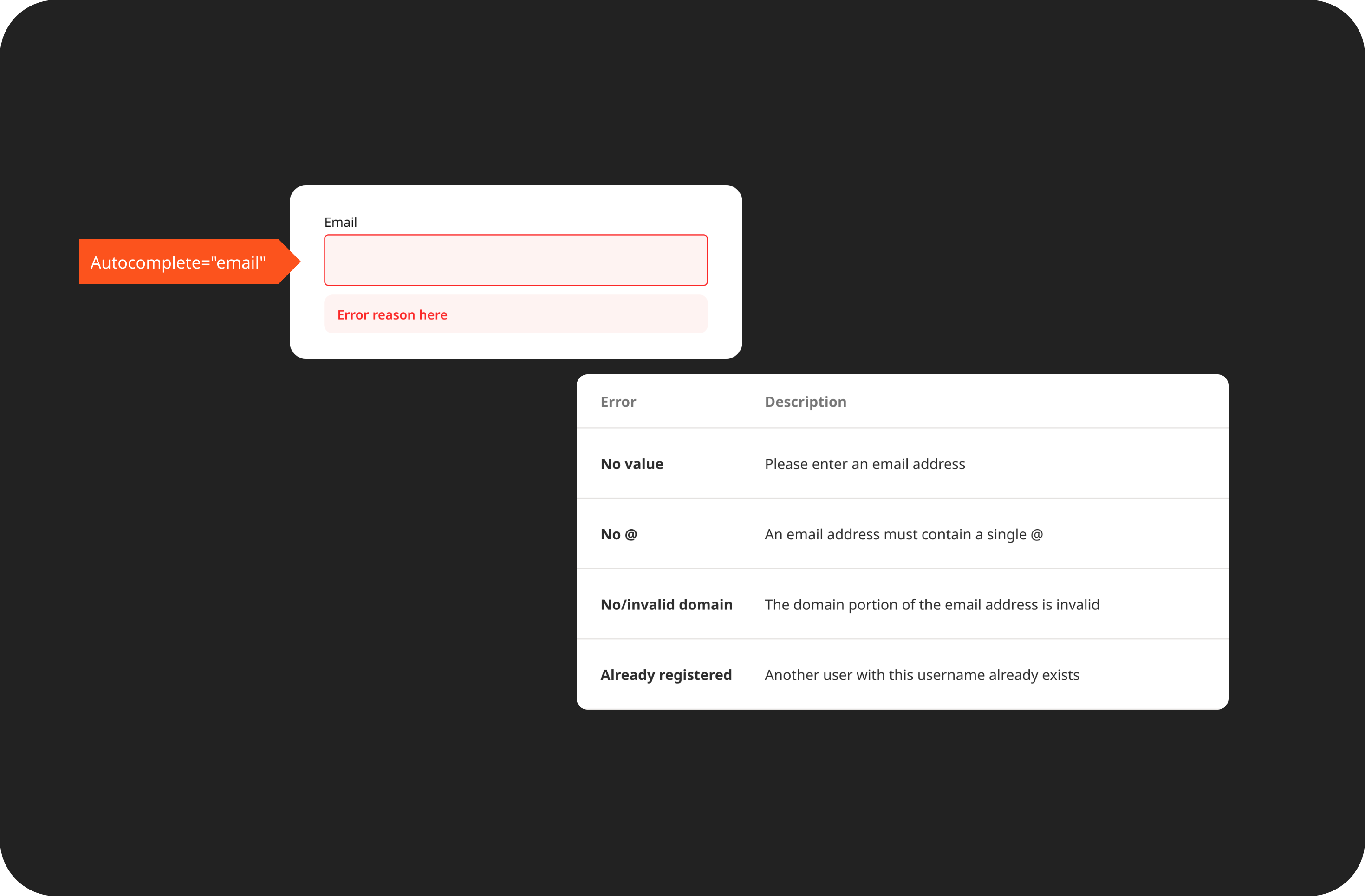 Introduced in design accessibility annotations & documentation
🧗🏽♀️ The challenge
The platform suffered from:
- Inconsistent design components due to different designer interpretations.
- Redundant UI components created over time by different designers.
- Feature additions were slow, with many requests for redesigns due to inconsistencies and errors.
- Stagnant sales and traffic amidst better designed competitor sites
🛠️️ Strategic approach
Collaborative discovery
Engaged stakeholders through co-design sessions to ensure collective buy-in and alignment.
Structured planning
Developed a detailed roadmap and project plan to provide structure and direction.
Communication rituals
Implemented regular stand-ups, transparent documentation in Confluence and Figma and async updates via Slack to facilitate communication, track progress, and maintain momentum.
Early results & anticipated impact
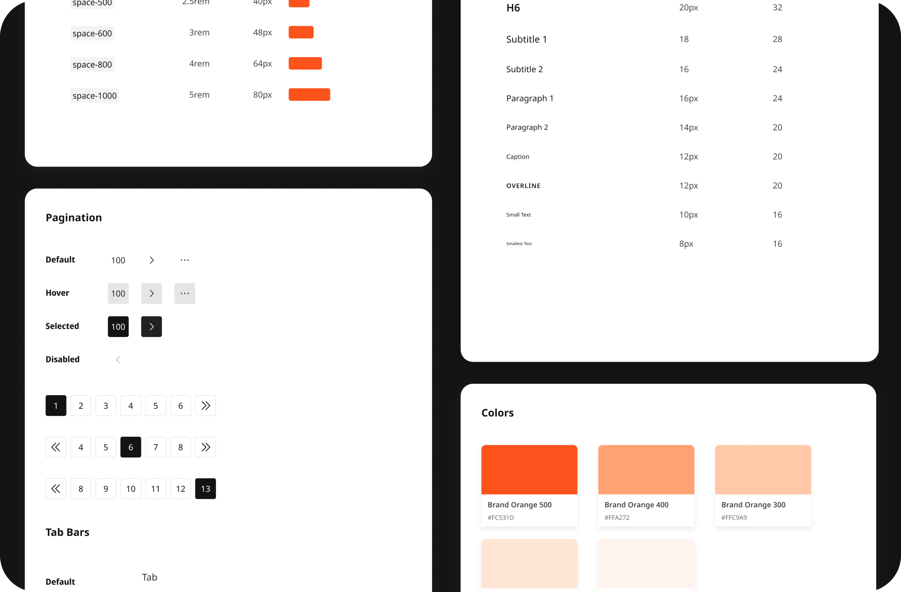
Established Figma file structures, versioning plans, and a base UI kit with design tokens.
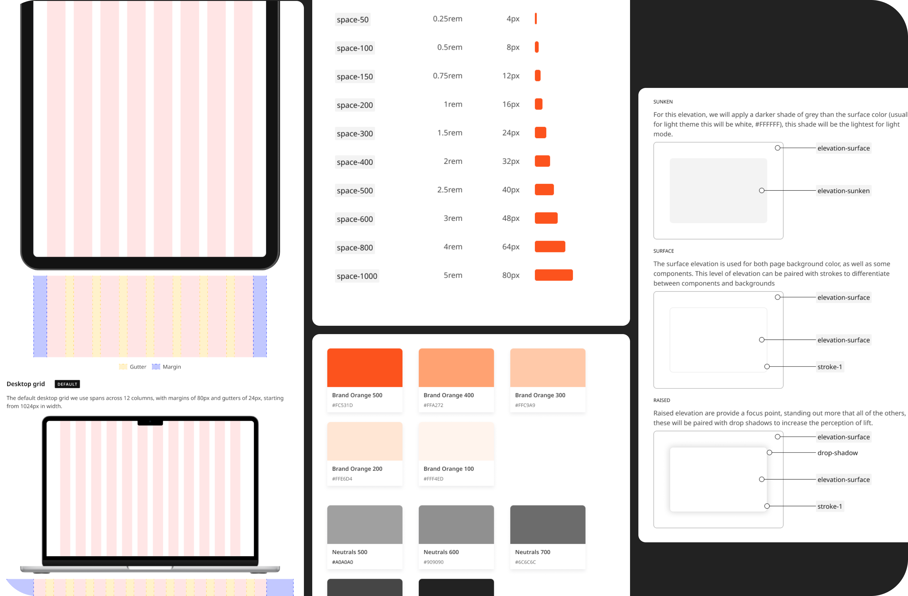 Set breakpoints & refreshed colour palette for better contrasts
Conducted a comprehensive audit, logged inconsistencies in paddings, font sizes, button states, and iconography, and prioritising components based on usage frequency and user-facing impact.
 Improved visual hierarchy of modals
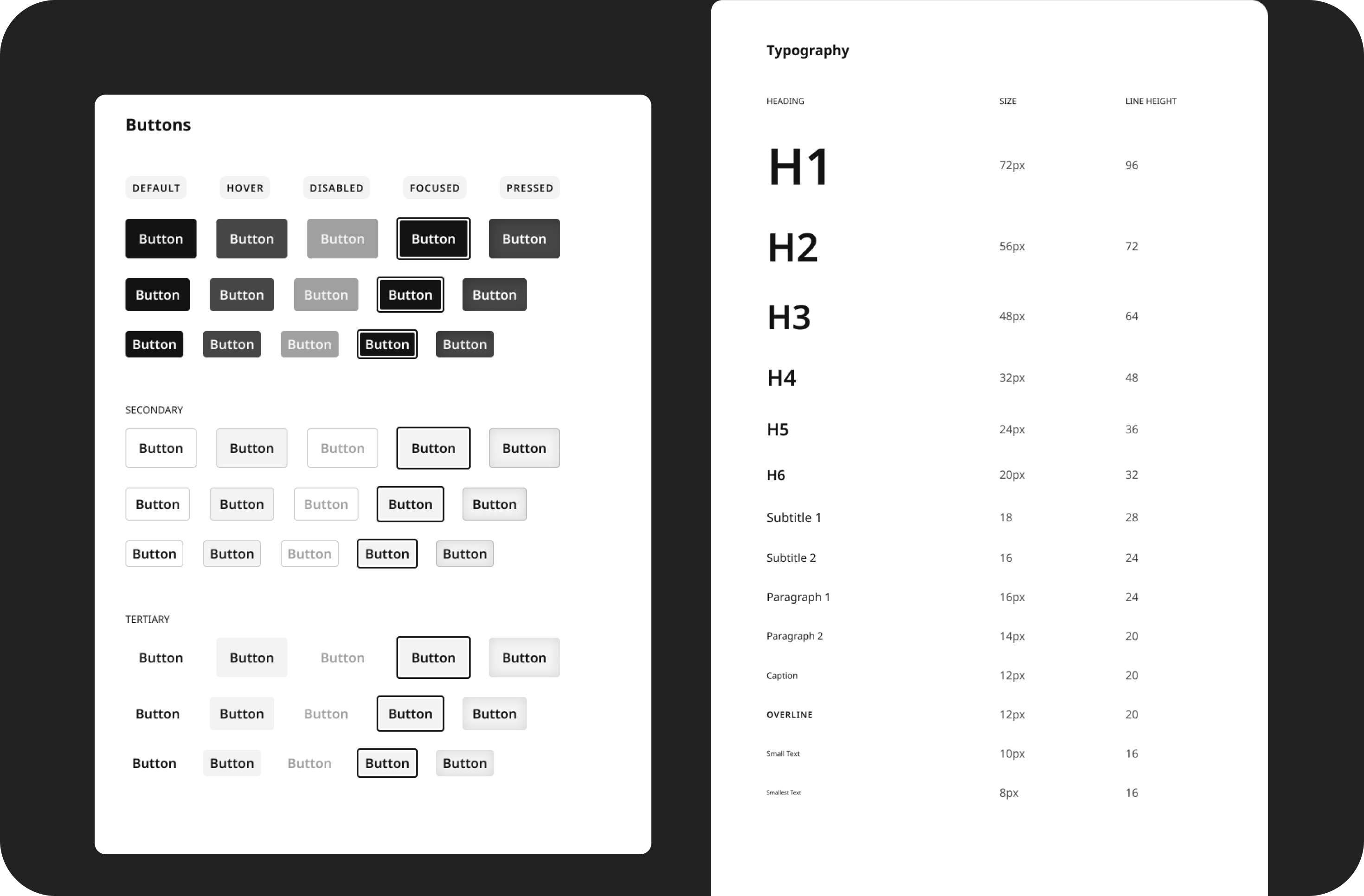 Button states & typography
Built POC components in Figma and paired with developers to validate feasibility, integrated design tokens into Storybook for real-time design-to-code sync and ran QA loops with developers to ensure pixel perfect implementation.
📈 Measurable impact
- Achieved a 40% reduction in design delivery time.
- Successfully integrated the design system into Figma, with widespread adoption across the design team.
- Notable decrease in bugs per feature due to standardised components.
- Improved accessibility scores, aligning with WCAG standards.
- Faster onboarding of new team members due to documentation and design tokens.
🌱 Lessons learned
Navigating a 100% remote team with multiple stakeholders required adaptability and clear communication. For me, this project was a great lesson in the importance of flexibility, and showed me the broader impact of design systems on organisational efficiency.