Reducing user friction– Redesigning a B2B/ B2C SaaS bookings platform
Early usability testing showed improved task completion (75%) and positive user feedback. The redesign is expected to reduce customer support reliance and increase user independence post-launch.
I led the product design process to redesign a B2B/B2C SaaS bookings platform. The goal was to modernise UI, reduce user friction by simplifying workflows and align the interface with user needs.
My role
I led the end-to-end design process — from discovery to delivery.
Methods
User research / Information architecture diagramming / Design audit / Building component library / Visual design / Prototyping / Testing
The challenge
The platform was built by developers, and over time has become complex and was experiencing feature bloat. There was an over-reliance on customer support for account set up and completing simple tasks (e.g. changing a booking time)’, which posed a scalability challenge for the business.
As the Product Designer, I was tasked with redesigning the platform to make it easier for users to navigate, ensure they could complete key tasks independently and successfully, and close the gap between our platform and competitors in both usability and visual appeal.
Defining the problem
Discovery workshop
To kick off the project, I facilitated a workshop with cross-disciplinary team members and stakeholders to determine business goals, user needs and pain points, understand how the team worked and define key objectives. We also set success metrics so that we could track the outcome overtime:
- Task findability rate
- Task success rate
- Time on task
- Support ticket volume
UX & Design audit
I conducted a design audit to assess the platform’s user interface, usability, and information architecture. This process uncovered inconsistencies in visual design, friction in task flows, and areas where key workflows (e.g. setting up an activity) were very complex.
These insights formed a prioritised list of issues and opportunities, which helped shape the redesign strategy and inform the project roadmap.
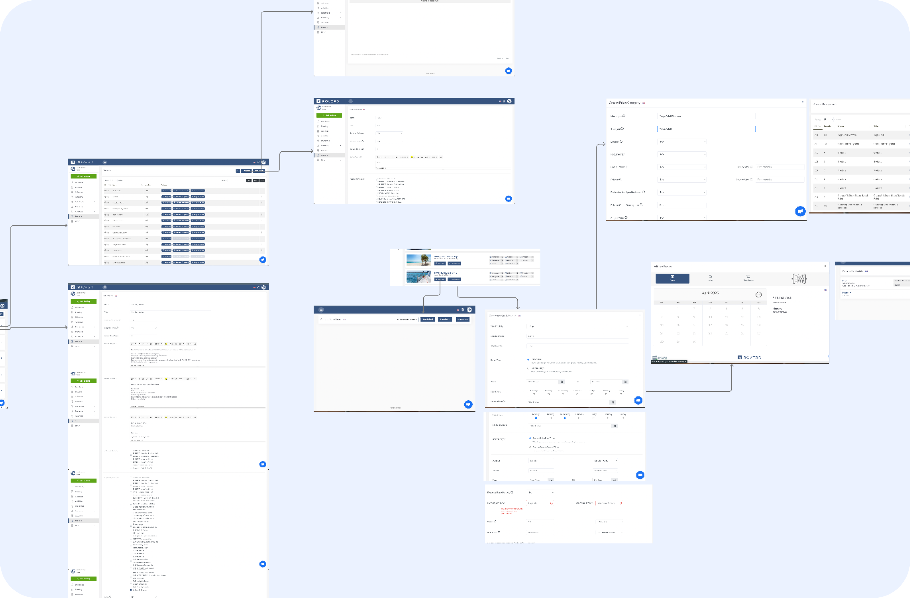 Visual map of the old platform
Card sort
Following the audit, I ran a moderated open card sort of the platform’s navigation to uncover how users grouped information and interpreted the menu labels. These findings informed a revised information architecture of the platform.
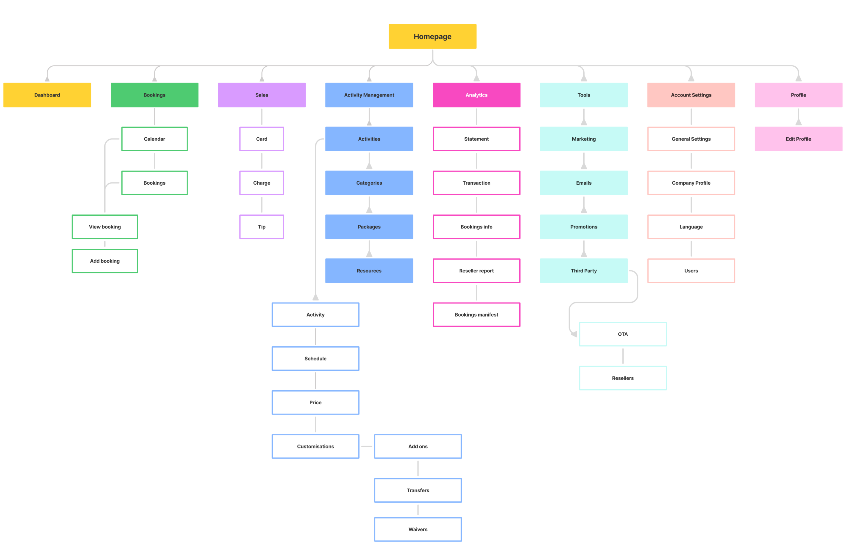 Refined information architecture to reflect user mental models & reorganised feature groupings.
User interviews
In parallel, I conducted problem discovery interviews to identify potential opportunities and gain insights into their goals and pain points. Key insights derived were:
Users wanted a faster way to search for bookings or transaction reports, but the current platform didn’t support this.
The existing dashboard didn’t surface relevant or actionable information to support users’ primary tasks.
Core workflows were hard to understand and execute independently, making it difficult for users to make changes without reaching out to customer support.
User flows
To align the team on improvements to the core workflows, I created visual user flows that mapped out the redesigned experience. The goal was to reduce friction and ensure users could complete tasks independently, without relying on customer support.
Design delivery
UI proof of concept & component library
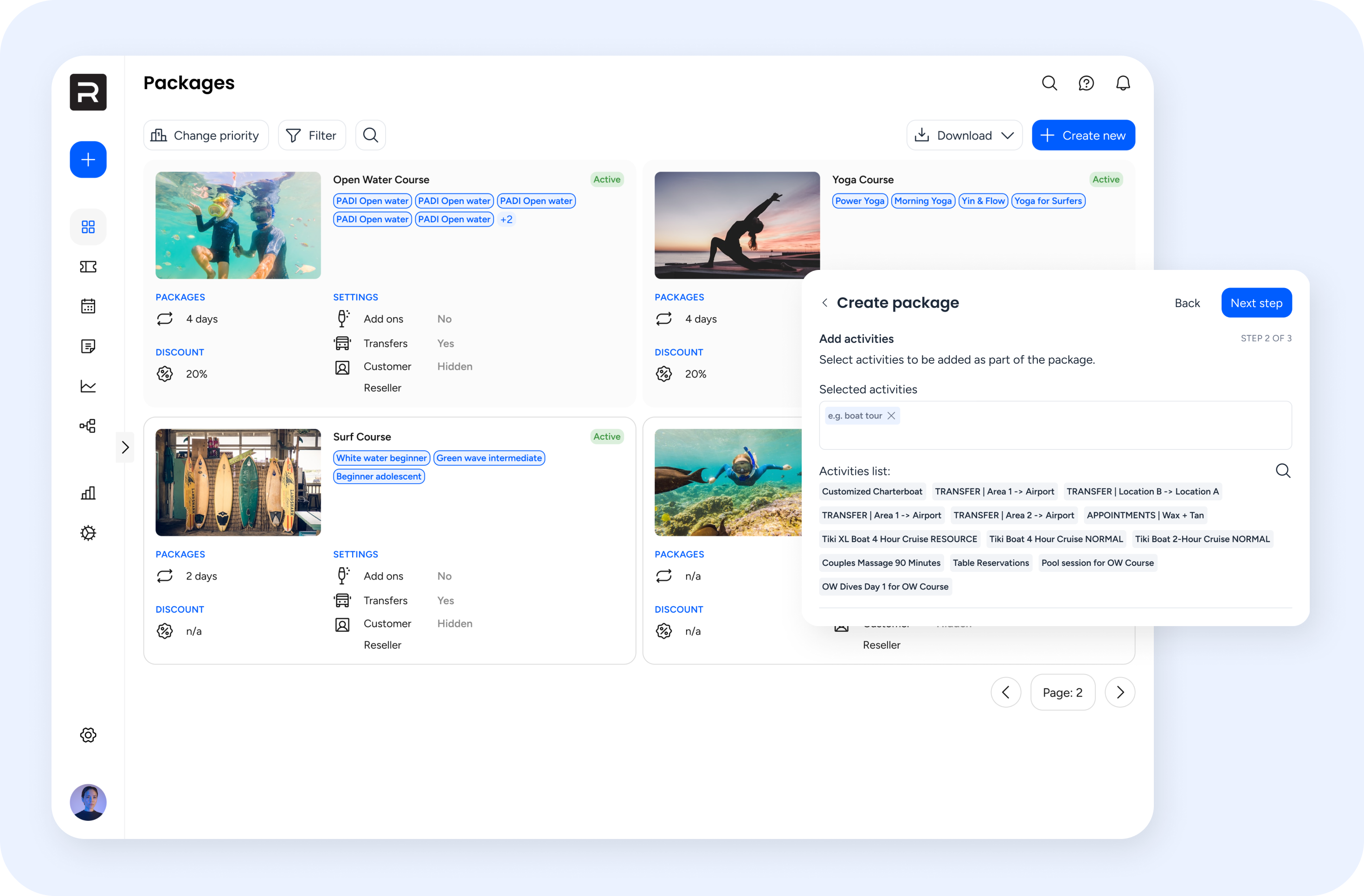
I began by redesigning one of the platform’s key feature pages that shared a number of common UI components with others. This was used as a proof of concept for the modernised interface, and to secure stakeholder alignment on the new design direction. I also used this to start the build of a lightweight component library to ensure consistency as the work progressed and help me work more efficiently.
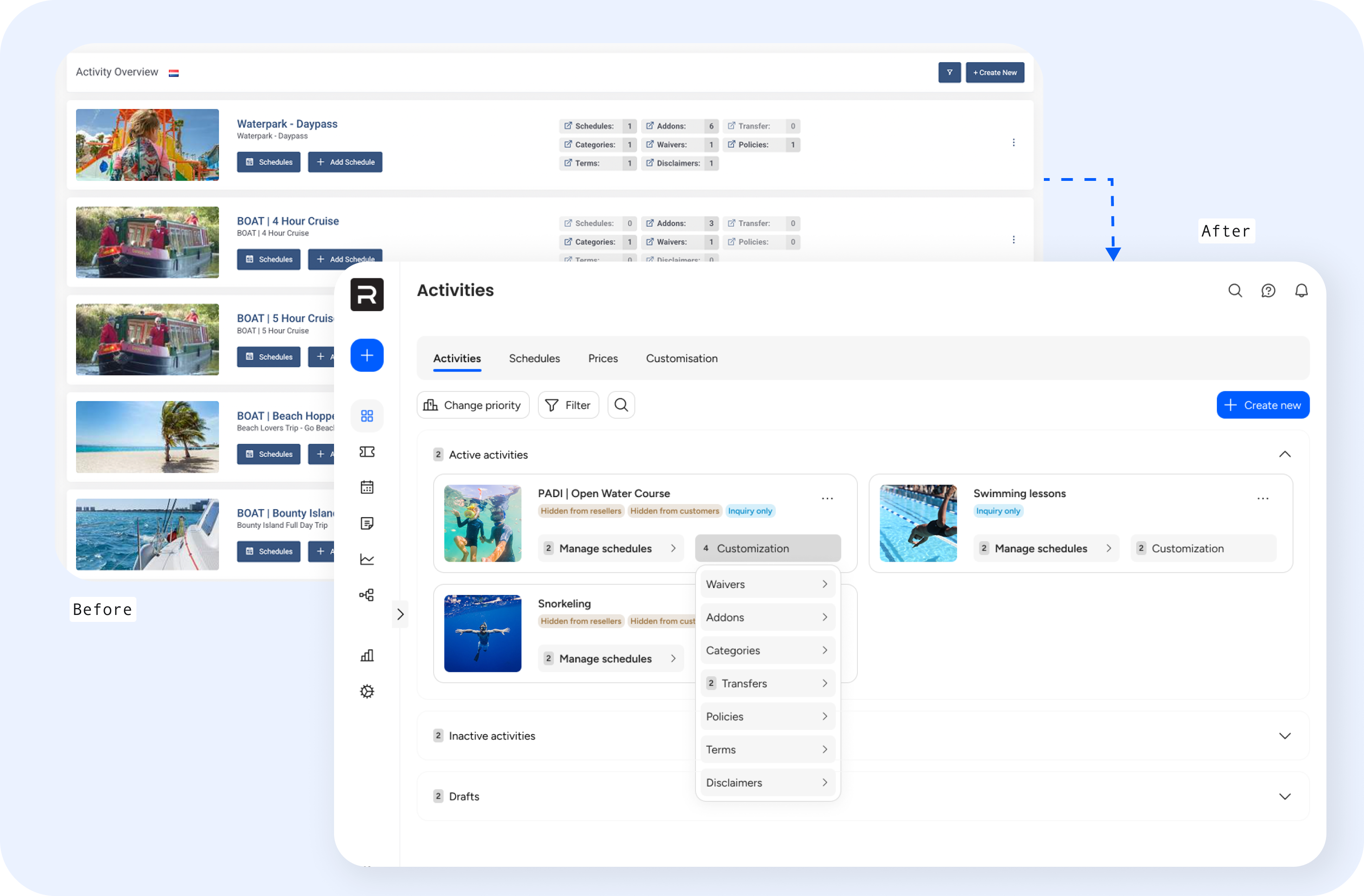 Redesign of one of the key feature pages
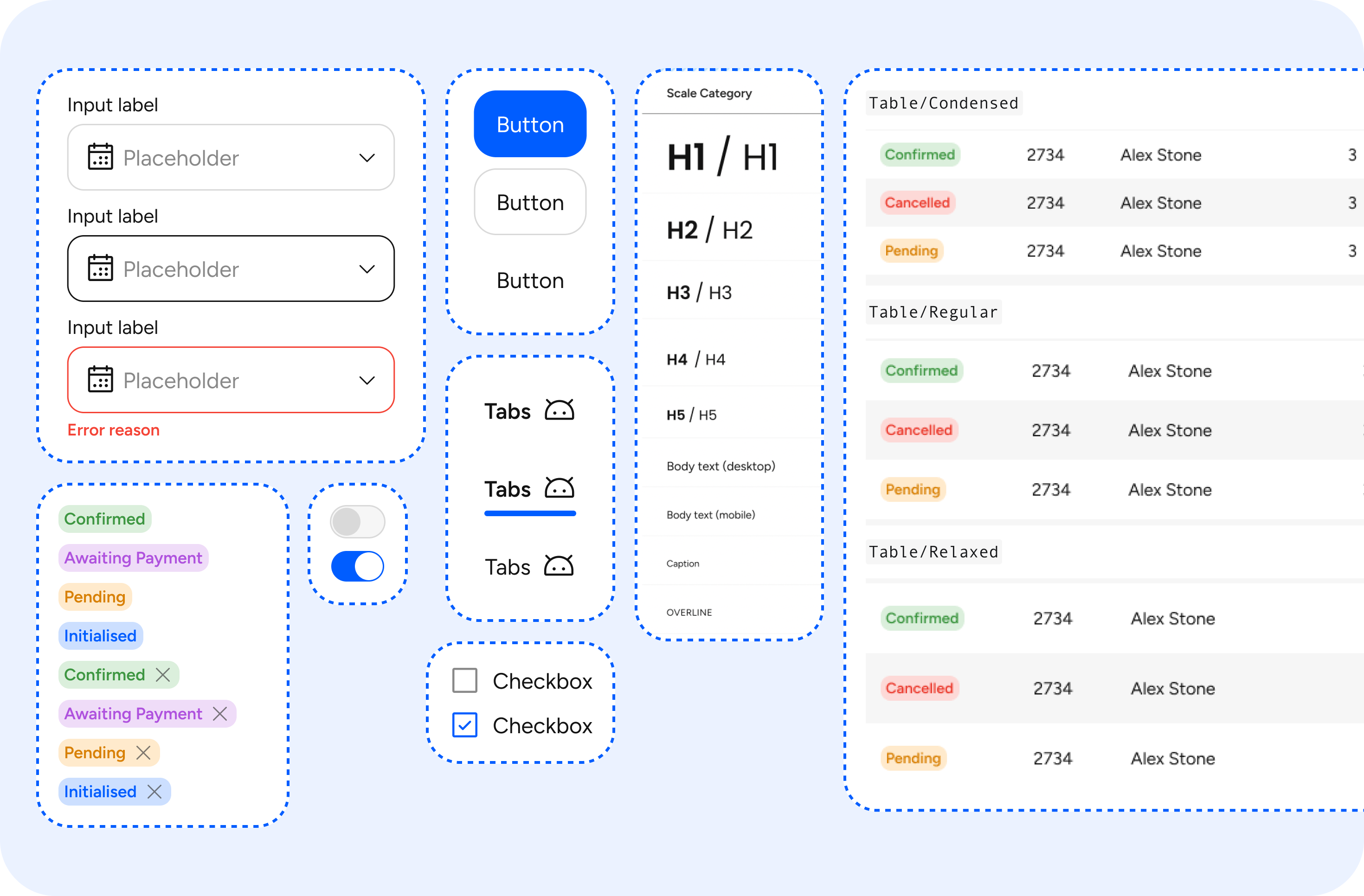 Component library built to work efficiently and keep consistency
Visual consistency
To improve the platform’s overall usability and maintainability, I established a set of reusable UI patterns and design standards. The aim was to create a more predictable experience for users and further lay the foundation for a scalable design system.
 Added inline and visual guidance and microcopy to guide users and minimise confusion.
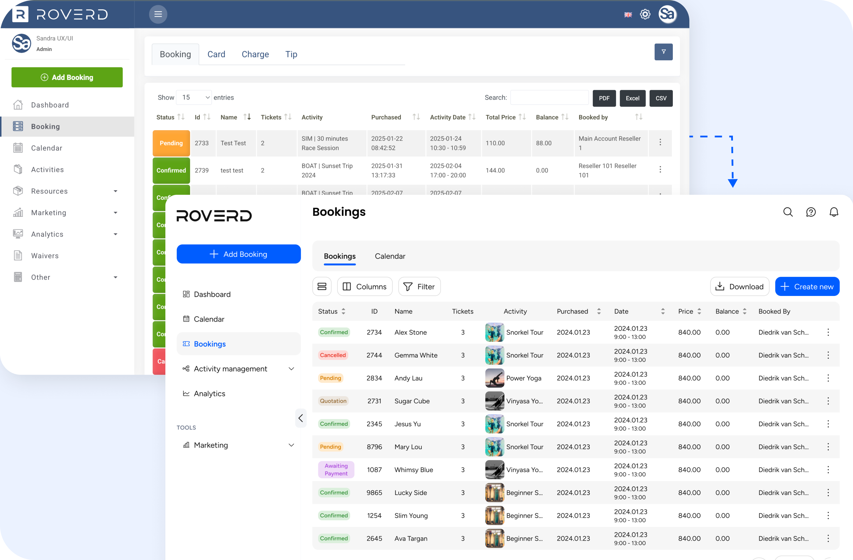
 Responsive layouts & different views of specific pages to accommodate different types of users and devices
Streamlining key workflows
To improve usability, I redesigned several complex workflows to reduce the reliance on customer support
Create an activity flow (B2B)
The original flow for creating an activity was unclear and required configurations outside of the create activity form without any in context guidance on where to complete said actions.
Key issues were:
- Steps were hidden or out of logical order
- Language was confusing or overly technical
- No clear feedback after completing an action
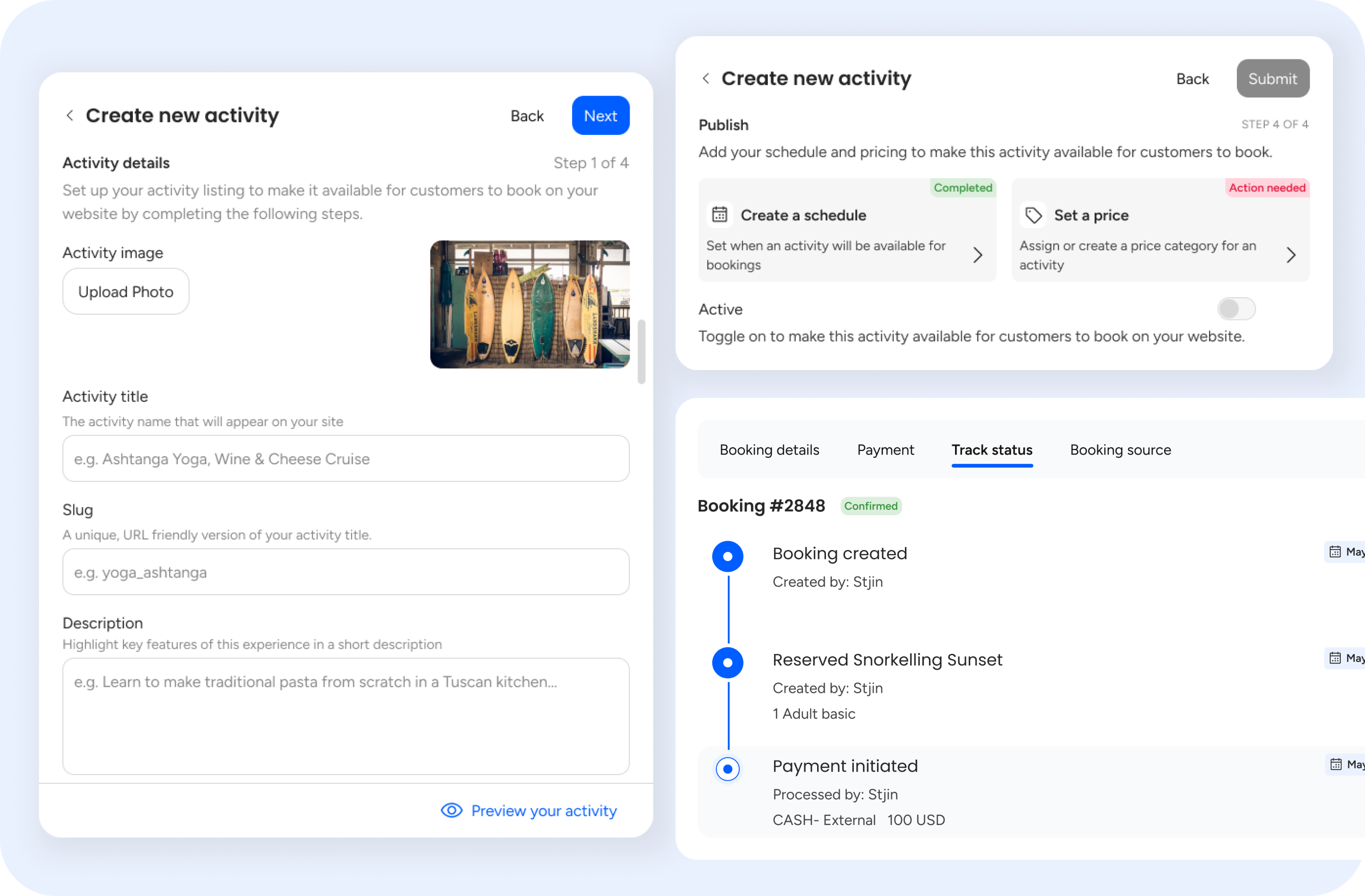
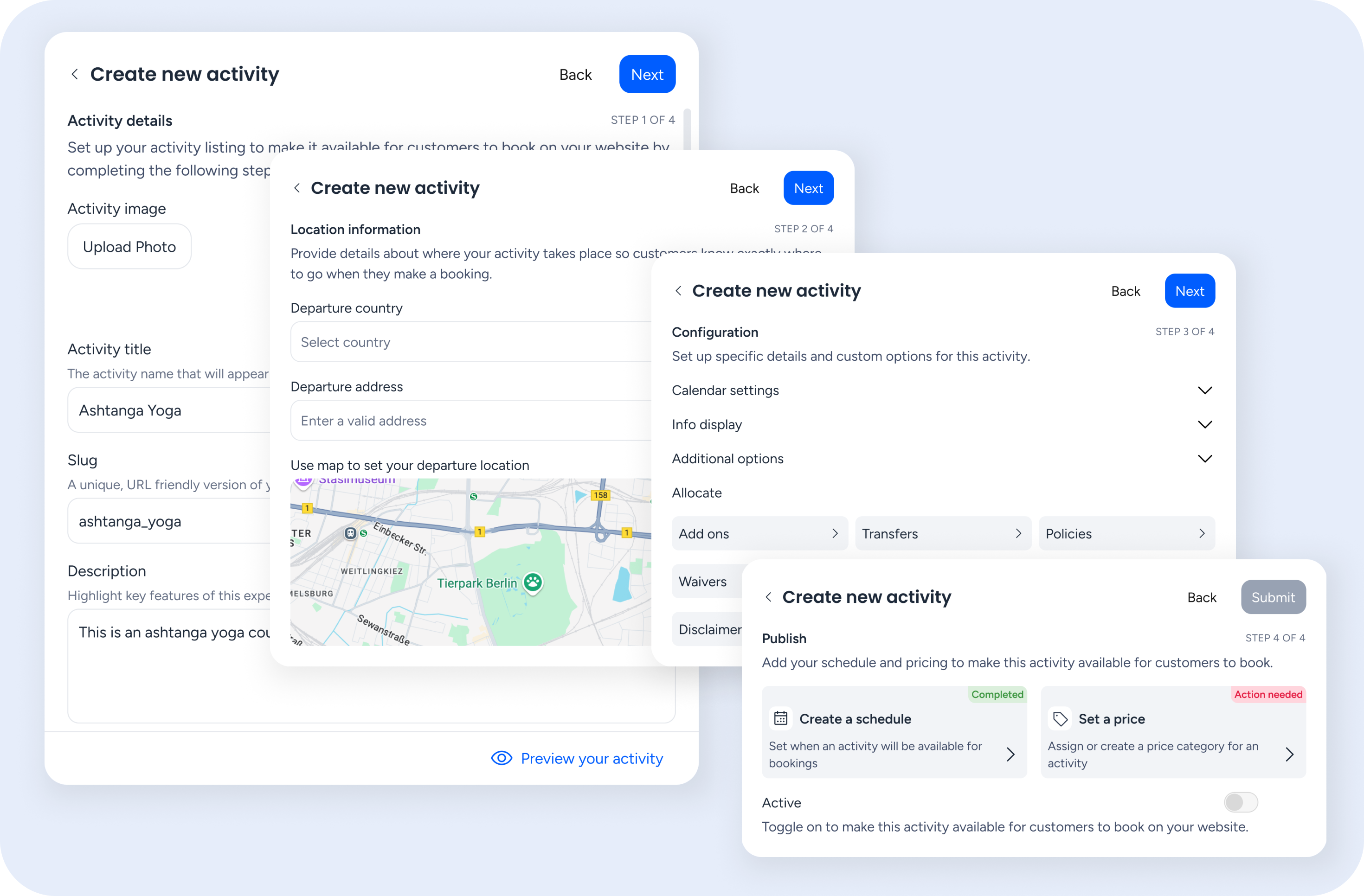 Create an activity flow
Improvements made:
- Streamlined the number of steps
- Clarified labels and added contextual guidance
- Grouped related actions and surfaced status updates
Adding a booking flow (B2C)
One of the key pain points was the long single-page form that customers had to complete in order to book an activity. The checkout experience also did not provide the customer a way to add more items or new activities to their final purchase without leaving the flow entirely. Finally, the checkout cart was named a ‘wallet’ and was hidden behind a show button which was confusing to users.
To address these issues, I redesigned the flow to follow familiar e-commerce conventions:
- Introduced a mini cart for real-time booking management
- Separated item selection from customer information input
- Added clear success states and feedback throughout the process
- Renamed and repositioned the cart for clarity and ease of access
Next steps
It was decided due to codebase limitations that a full rebuild would be necessary, with early beta access being introduced to selected users for feedback and gradual onboarding.
While development had begun work on the cosmetic changes, I conducted usability testing on the revised flows to gather feedback, address any issues we may have overlooked and gain an idea of how the redesign would impact the platform.
Reflection
Being the first embedded designer in a company without an established design culture came with its challenges. I often had to advocate for the value of user research and make strategic decisions about which methods to use based on time, cost, and potential impact.
It was a valuable exercise in balancing ideal design practices with real-world constraints, and in learning when to prioritise, and when to let go. It was also a learning experience in how to advocate for users in a fast-paced environment, and showed me how much impact small design changes can make when aligned with user needs.